Final
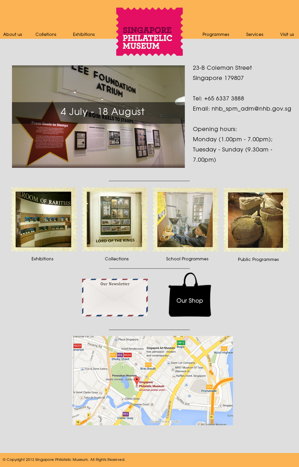
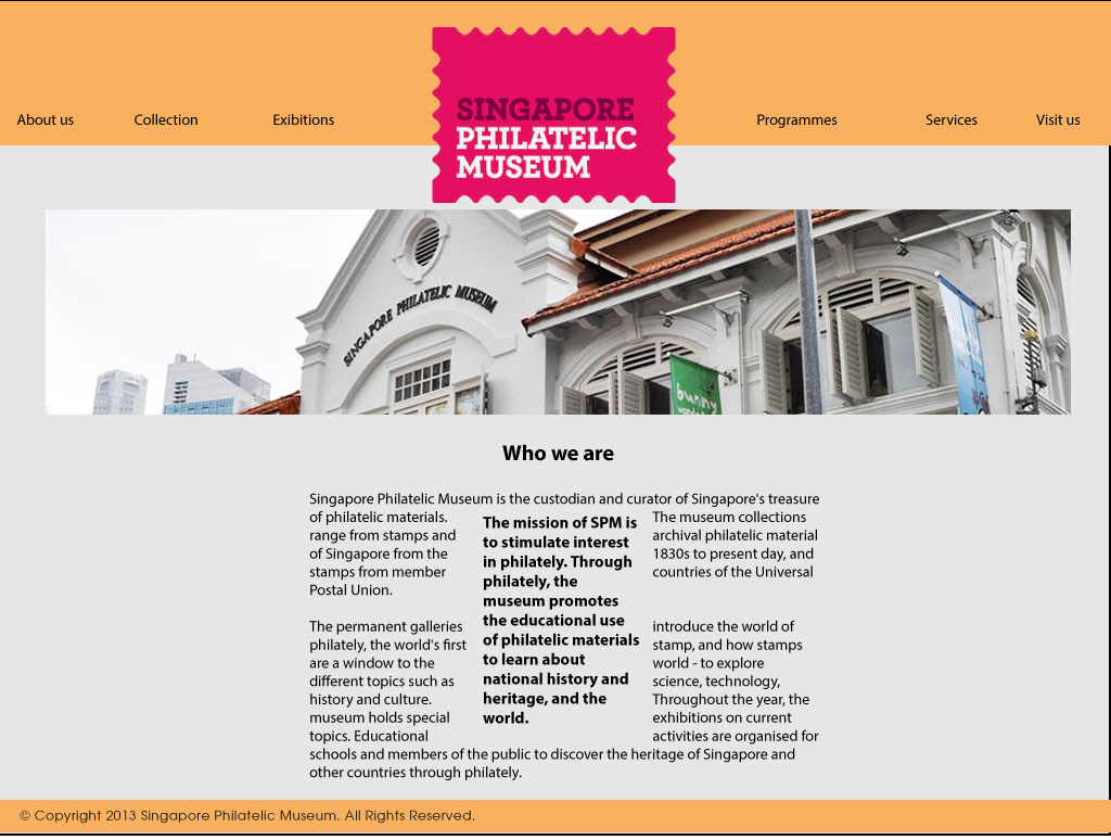
Pre-revamp - 2013 Site
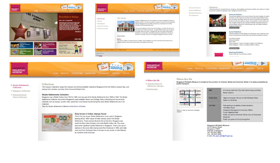
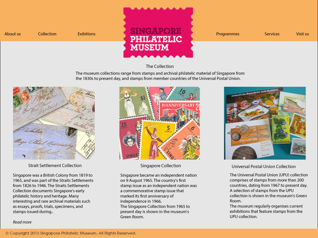
The previous website had a lot of conflicting colours, drawing attention away from any key visuals or focuses they want to have. Many of the images were also extremely small on the main page. Although it is understandable that the museum wishes to convey as much knowledge of its collection and exhibitions to the users, it is very seldom that a user would read a page with that much text.
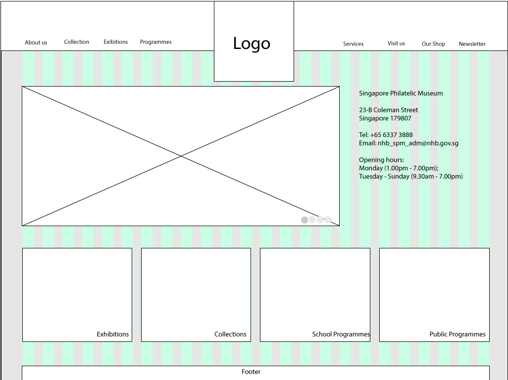

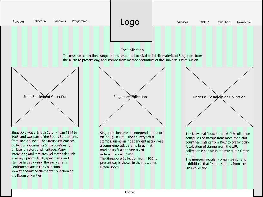
Initial Wireframes
Initial wireframing was more on shifting key visuals into focus, keeping to a neat and sleek structure.
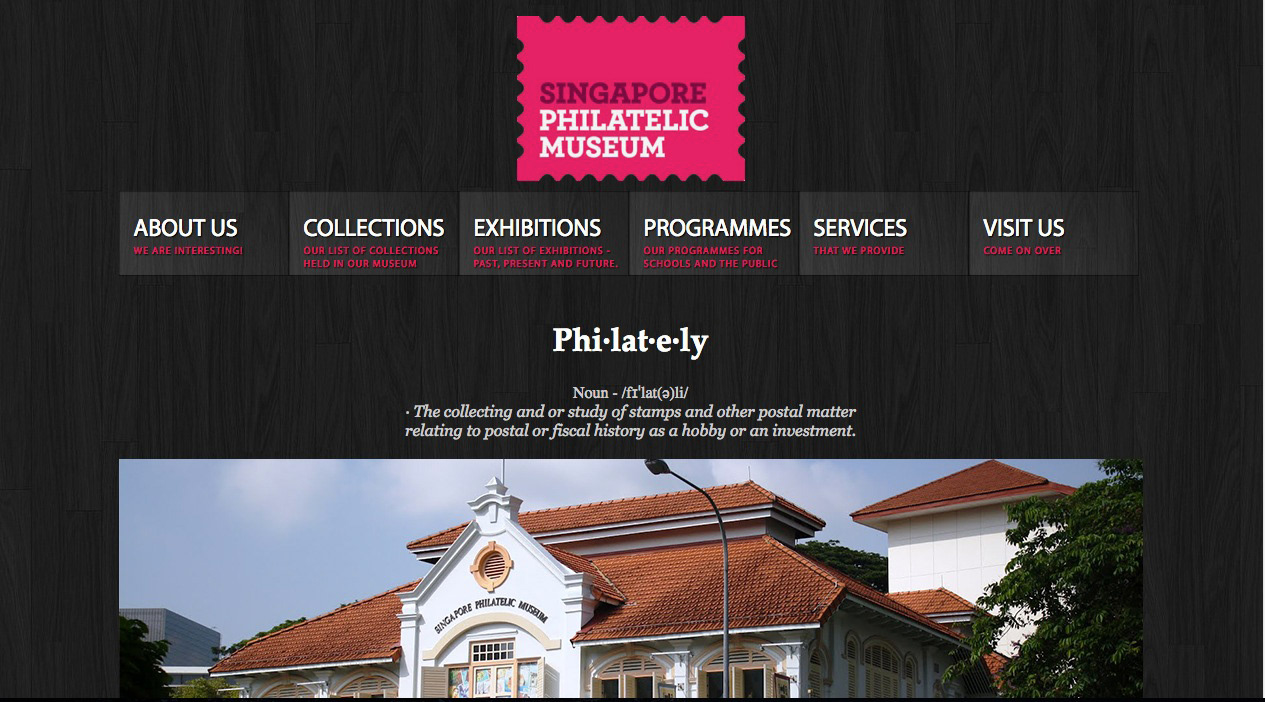
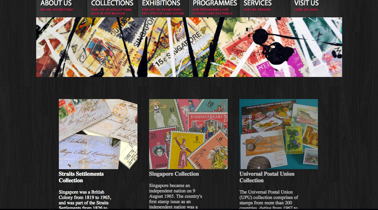
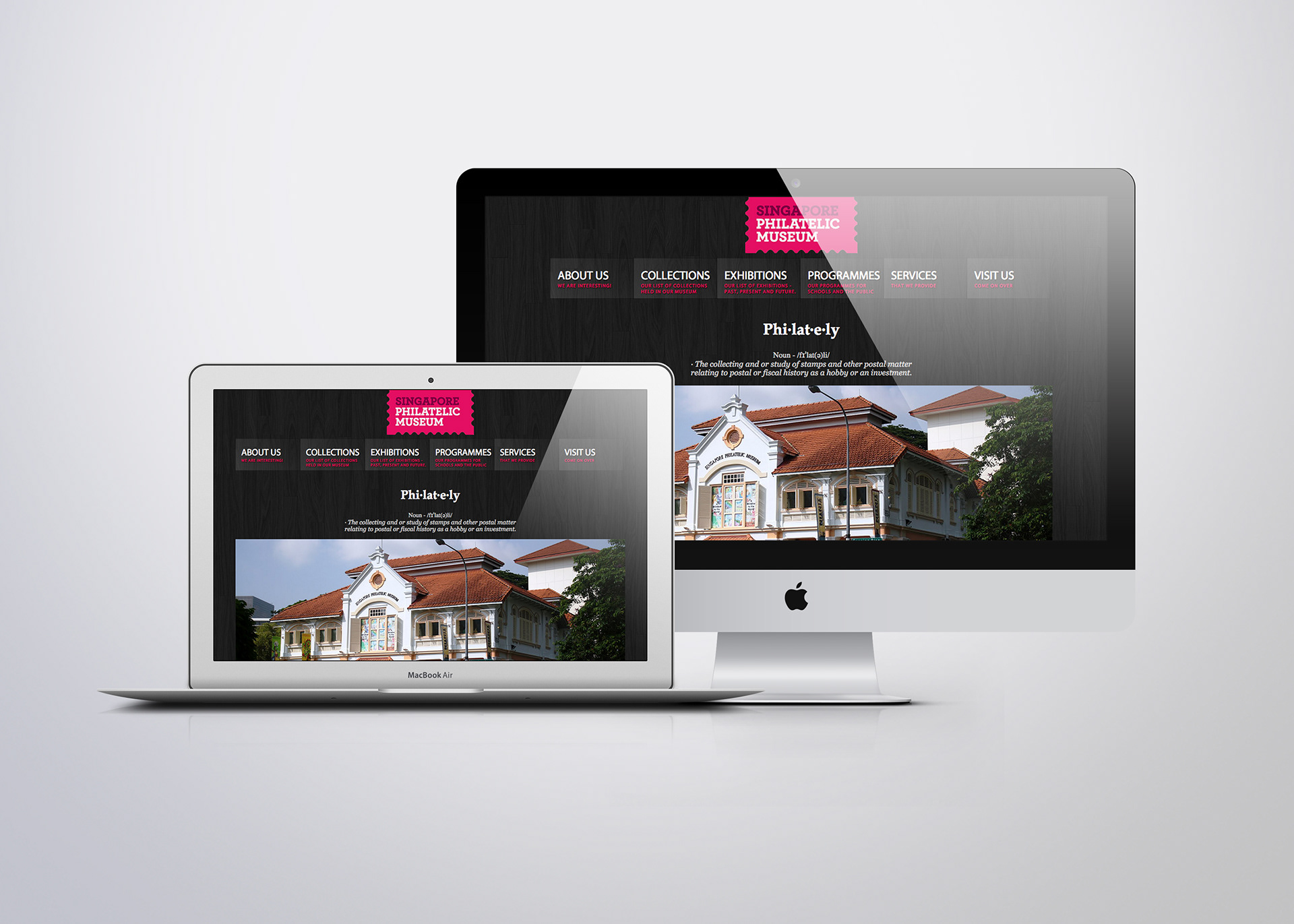
Further refining the design, I opted for a darker colour, sleeker and more modern colour scheme, as well as an animated navigation bar to break away a bit from the strict structures of the previous design.